Wednesday, 30 March 2011

my 2nd Front Cover draft.


here is my 2nd draft, as I decided to change the style of the front cover, such as the photo. I removed the small section at the bottom such as the other band names, as I felt it was too full and busy. I will be using the font 'Georgia' on the front cover, aswell as in the magazine, to keep with the housestyle.I will also add a barcode to make it more realistic.

Using Photoshop on my front cover.


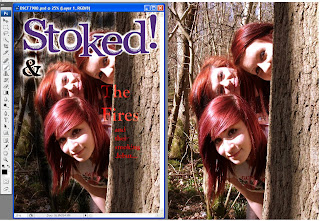
This is my image that I would like for my front cover, and I have decided to edit it in Photoshop. I pasted my magazine title onto the photo and used the eraser to remove the white background, leaving a glowing white outline, so that it stands out from the background and I also did this on the '&' sign. I used the text icon to type text, and used a 'Linear Dodge' effect on the text, and coloured it red to keep it relevant to the band name. I have also darkened the background on the left, so that the text is easier to read, as when I would add text on the left hand side, it was difficult to get the text to stand out. One problem that I am finding is that the 'The Fires' text doesn't stand out as well as I'd like it to, so I will play around in Photoshop to see how I can resolve this. I didn't like the colour of the magazine title against the background, so I will change the title to black. I would also like to make the magazine title be overlapped by the photo.

Wednesday, 23 March 2011

Samples and Ideas for my Contents Page.

Here are samples of photos and layouts for my contents page:

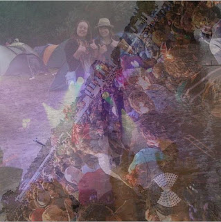
This is the photo that I will use for the 'Stoked! Festival' box in my contents. I created this from my own photos of when I went to Reading Festival last year. I selected photos that showed the crowd, tents, and also a picture of a band playing, as they are some things that people associate with festivals. The photos I used were:

- a long shot of me and a friend in the muddy campsite!

- a high angle shot of the crowd at the main stage.

-a wide shot of the band 'Kids In Glass Houses' playing, that shows the lights, and the crowds hands.

I used 'Multi-Exposure' again on these photos, to be able to get them all in a small space. I like the mixture of them together, as you can see features of each bit, and it also creates a nice fantasy purple colour from the mixture of the stage lights. I would like to have the 'Stoked! festival' logo on top of the photo, as this will show what the photo is relevant to.
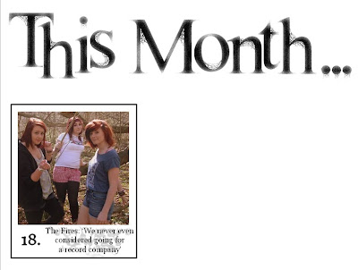
This is a section of what my contents page is looking like during the construction, and the first content box I have done. I edited the 'This Month' font by adding an 'artistic effect' that makes it look slightly faded, to make it look more interesting. It is similar to the magazine logo, but has a slightly different look to add variety. I placed the photo in a black outlined box and used another artistic effect to edit the number '18' and the small quote. I like the small text, because of the wispy snakelike shape behind it. I then 'sent backwards' the text quote on Microsoft Word so that the outline doesn't show. I chose this mid shot photo because they are positioned close together, and are looking directly at the camera. This next photo will be for the 'Indie Style' section on the contents page. I wanted to do this because I think it is an interesting addition to a music magazine, as some readers are likely to be style conscious. I also wanted a small section on fashion to add something more to the magazine. I took mid shots photos of myself with an eagle tshirt, a check shirt and a close up of the satchel bag. I created the collage on Picasa, by selecting the photos and making them into a 'mosiac'. I like this way of presenting the photos because you can see snippets of each photo, whilst having multiple photos in the same area.

Sunday, 20 March 2011

Magazine Photos

Here are my photos and edits that I took at Orlingbury Woods, in the form of a slideshow,uploaded via Slideshare. My models wore tshirts that had graphics on them, 2 wore tops that had band names on them, and all of them were shorts, some with tights aswell. They all wore trainers by Converse and Vans.
Magazine Photos
View more videos from shilu27.

I use the photoeditting software Picasa to edit my photos. I decided to not use the idea of the models holding matches in front of their faces, as I felt it didn't have a lot of relevance to the photos for the dps, so I have taken midshots of the models to use as the front cover photo. My favourite potential cover photos are:

1. I like this midshot photo, because their hair and facial expressions stand out against the natural background. It isn't too flashy for a front cover image, but shows positivity and personality. I wanted the models to peer from behind the tree trunk because it makes the photo look more interesting and it is relevant to their band name.
2. This photo is a midshot of the models, smiling at the camera. Whilst it would be suitable for the front cover, I feel it could have been made more exciting, as there aren't any props or anything that particularly stands out in the photo.
3. I really like this photo because of how the models are positioned in different poses and distances from the camera. Also the warming tones I use give a glazed effect to the photo and it looks very summery and bright.
4. I like how the models are positioned at different heights, it looks more suitable for a cover. You can clearly see their faces, hair and t-shirts. Direct eye contact with the camera makes the photo look less casual and more striking, however i feel this photo has the same problem as no.2 as there are no other features to the photo.
5. This is my favourite potential cover photo of the models, because of the peering from behind the tree and how it is from just one side this time. The main focus is their faces and hair, it makes them look spontaneous, fun and mischevious too!

Friday, 18 March 2011

My Magazine Festival Logos.

As I already have my magazine logo, I am going to use this same style for titles of pages such as the contents page and my double page spread. For the festival I will be making up, I need a logo to illustrate this, but still has the same font.
Here are some festival logos I have looked at for inspiration:


A common feature is a bold simple font that clearly states the festival name. My festival will be named after the magazine so it is easy to remember. I like the Download logo because of the cartoony drawings in the background, they could appeal to teenagers and young men and women. Rockness and Reading are my favourites, I like the slightly fancy font of Rockness, but feel the Reading logo has more to it, with the black background and jagged border. For my festival logo, I will make it simple but memorable. I will keep the housestyle of black white and purple to keep the theme consistent. I would like the logo to have a purple glowing effect as a way to make the logo to stand out more, against a white font that is outlined black. I may be able to make this on Picasa, if that is not successful I will have to look at editing my text using Photoshop.


Wednesday, 16 March 2011

The body text of my double page spread.


This will be the body text that will be on my double page spread, it will be in paragraphs, and I will be taking inspiration from NME and also Elle magazine. They don't use a generic Q+A set out and they write it like it is a story. I am a regular reader of Elle Magazine, and their main article usually starts off with a paragraph that describes the person being interviewed. I like this as an opening as you get a detailed description of what the person looks like, and you get a brief idea of what their personality-wise. Then it gets more indepth and they start being asked questions. It has a more relaxed informal feel, which suits the rock/ indie genre.

My Body Text:
The Fires, the name alone has a presence about it. As they pose for my photos, they have this charisma that I've never known a girl band to have. No pretention, no drama, no frilly pink dressing rooms. No false smiles and false personalities. Just what's real and what rock music is all about. When I first heard about The Fires I was at an open mic night at my home town of Kettering, Northamptonshire in August 2007. I went there not expecting to hear a breakthrough act of the decade, just to hear the local music scene. But when they took to the single mic, on a basic black stage with dingy lighting and a crowd of 10, my ears listened intently. They sung the first song they'd written together, 'Wasted'. Whilst it was typical of a rock/indie genre, talking about drink and drugs, it also made me sense they'd all discovered heartbreak, and that their good hearts felt 'wasted'. And at this moment I thought to myself, 'now this is talent that can not be wasted'. I approached them with excessive excitement in my eyes, to them I probably looked stoned out of my head, but I was too enthralled to care what I looked like. I suggested they spoke to a local record company that I had contacts with. 4 years later and we meet again, in an autumnal forest outside of Kettering. Because who wants to conduct an interview in a plain 4 walled room?

The first thing that is charismatic about them is the look they have, particularly with their style. Sam Maber, she is the front singer with a retro red bob with a sharp black streak, her clothes are casual yet stylish, classic skinny jeans and tee teamed with a vintage granny cardigan. Senna Riccioni with striking purple hair, doe like eyes and an attitude that fuels the passion and emotion in their lyrics. And there's Caitlin Savin, with her cute copper hair, a fun fashion sense and a good nature that keeps the group together at the toughest times. It's all these different combinations of style and personality that make the perfect girl band. So it seems like they're the ultimate rock girl band, do they feel the same? 'We feel very lucky that we all bond so well as a group, but there are times where times are tough. Not getting noticed enough when starting out was so difficult and frustrating, people in our town wouldn't take us seriously because we were 'just another girl group'', Sam talks of their early difficulties. I asked them how they felt when I first approached them about the local record company..'We had never even considered going for a record company, we didn't feel we had the experience and knowledge at that moment in time, but when you came up to us and complimented us, it gave us a boost to make the effort and bite the bullet. And we couldn't be more grateful, as we wouldn't be here today without that confidence.' expresses Caitlin.

So what about their first album? Will it all be reminiscent of their song 'Wasted' which went straight in at number 3 in the charts last week? Or will they venture into new areas? 'Our album has the same soft rock as in our debut single, but there's also some happy songs too! We didn't want an album that was based on negative experiences, because it drags us down, we'd rather write about the good times in our lives, even if it's just an awesome party we've just been to, where the walls were shaking and we're get so trolleyed we can't remember a thing', Senna laughs as she tells us more stories about house parties and after parties they've attended over the years. As 'The Fires' are new to the festival scene, any stages lined up for them this year? 'We're not allowed to say!' Exclaims all the girls.' Lets just say this is going to be an extremely busy summer, and hopefully one to remember' Sam says as a cheeky smile ricochets its way around the group. Okay so they're not allowed to say, hands bound by the festival organisers of England. Any past festival experiences they've had? 'I've been to a few, I love the atmosphere thats there, everyone is happy, drinking and smoking like there's no tomorrow. But being right in the centre of the crowd is just amazing, considering how many people go.' Caitlins says of her memories. 'The best thing for me is just being in the crowd, yes you're sweaty as **** but who cares? You're in this moment thats different for every band you see, and you won't get that same feeling anywhere else' muses Senna.

So here you have it. I think of them as my little discovery, but I want thousands of people to discover the talent of these three girls. Let's just hope they don't burn out for a while..


As this is just a draft, I may go back and edit it. I have used language features such as descriptive vocabulary, emotive language and colloquial language. In my final DPS I will include relevant quotes around the text, to break it up a bit, and to make the graphology more exciting. I shall add a small caption at the top overlapping the photo to introduce the article.

Monday, 7 March 2011

Summary of my shooting schedule.

I will be taking my double page spread photos on the 19th March, in Orlingbury Woods which is just outside of Isham. I will plan to get there around midday because it will be darker later on, which will affect the quality of the photos. My models are my friends Sam Maber, Senna Riccioni and Caitlin Savin, and they will be the band 'The Fires'. Because I would like to have the empty beer bottle props from the Pocket Park location, I will collect empty bottles from my house and scatter them on the floor of the woods to recreate the look. I will have to make sure there is no sharp glass and that when I am finished I dispose of them sensibley. They all have reddish/purple hair which gave me inspiration for the name of the band. They will be wearing quite casual clothes that represent the laid back elements of the rock/indie genre, such as jeans, a graphic t-shirt, and Converse shoes. They will have fairly natural make up, as lots of colourful make up is typically associated with pop genres, but I will make sure that the make up accentuates their eyes, in the style of Florence Welch out of Florence and The Machine.

My front cover photos will be taken in my bedroom with the room blackened by closing the curtains. This will help me create the slightly eery haunting effect. The same models wearing the same clothes shall be in these photos.

My contents page will have various smaller photos, such as
- My friend in front of an amp to show an artist, and also relates to the music they play.
- I will be using photos from when I went to Reading Festival to mirror the atmosphere at Stoked! Festival (making sure any logos or items related to Reading Festival are not shown)

First draft of my magazine.

Here are my drafts of the front cover, contents page and double page spread..
My front cover has a dark background, but when the matches will be lit, features of the girls faces will stand out. I have included a range of stories on the front cover, and also a chance to win 'Stoked! Festival tickets' as a reward for readers. I have decided I will still have the album names at the bottom right, but no photos, as they will draw the attention away from the main picture.
My contents page has a grid style, the background is plain but will look more interesting when the photos are on the contents. The font is similar to my logo, to keep up with the housestyle. The feature for the 'festival' will have a logo which I will make, and photos that I took from a festival that I went to, making sure that I don't include any logos of the festival.
The 6 main features will be:
-The Main Story about 'The Fires'
-Stoked! Festival Tickets (festival photos and logo)
-2011: The Return Of Rock To The Charts? (model by amp)
-Natalia Himal: The Latest Indie Sensation (photo of model in field)
-Indie Style Clothing Brand feature (photos of clothes/models)
-Regulars (posters,letters,reviews, also info on subscription)
My double page spread will have an eroded black background, I will look into using Photoshop for the background. The title will be in the same style font as the magazine logo and will either say 'Girls In The Fire' which refers to a Pendulum song which are a band that feature in rock/d+b genres. There will be a large long shot photo under the title, and the main body text will start underneath the photo and carry on on the next page. Text will overlap the photos and I will use an interesting graphology to make it look more exciting.

Thursday, 3 March 2011

Finding the locations for my photos and Risk Assessments.

For my front cover, I would like the photo to be taken in a dark room, to create a mysterious atmosphere. I want my models to be holding matches in front of their faces so you can only see their eyes and mouth, also the picture will go with the band name, 'The Fires'. I would have to be careful with the matches because it is a slight fire hazard.

I have chosen 3 possible locations to take my double page spread photos. The first location is the woods in the Pocket Park, Burton Latimer. I liked the leaves on the ground and that it was quite open and quiet, with lots of tall trees. There were remains of a bbq, with beer bottles lying around, I think it adds to the rock/indie genre because some conventional rock songs sing about socialising and drinking and having a wild night. As I will be taking the photos in March, the weather will not be extreme, but it could be a bit cold and possibly wet from rain. However litter and glass could be a hazard, particularly if it gets caught in our shoes. This location is quite hidden from the public and is quiet, so interaction from the public won't affect my work.


The 2nd possible location is a deforested field in Burton Latimer. What drew me to this location is the large pile of wood logs. I think it would be an interesting background for the models, because it is a bit different, and also links with the band name. I could maybe have the models standing on the logs, I would have to make sure it is safe first, as the wood logs could be unstable. I could also have the models sitting on the slightly shorter stumps of wood, so they are at different heights. This is also a quiet area, as the field has a gate, which means the public won't obstruct my photos.


My 3rd location is Orlingbury wood. I love how the trees on either side of the walkway make it look enclosed and how it looks like an arch. I love the way the trees have jagged edges at the top, and how it looks quite haunting. It also has a similar floor to the Pocket Park location, full of leaves. This forest is away from a country road, so it is deserted and quiet. I think it is perfect for my photos, because it has the right look, it is quiet and is sheltered, which means that if it happens to be windy on the day I shoot, it won't affect my photos as much.


Choosing my magazine font.

I wanted my magazine title font to be slightly fancier than the main body text, so I looked on Dafont.com for inspiration. I found these 4 fonts that I particularly liked:


They are all quite bold, and fit the slightly fancier, but a slightly dishevelled and eroded look I was going for. My favourite is 'Vinyl George' because it reminds me of the 'Georgia' font on Microsoft Word, which is the font I am going to use in my main body texts. To recreate this font, I am going to write the magazine title in 'Georgia' font from Microsoft Word, copy it to Paint, and add black lines to create the dishevelled effect. I also used the Fill tool to change the colour to a dark purple.


Here is my final font, I made the lines look like spiders webs.

The font I used for this blog post is the font i'll be using for my magazine writing, I may change the masthead colour and font according to different sections of the magazine.