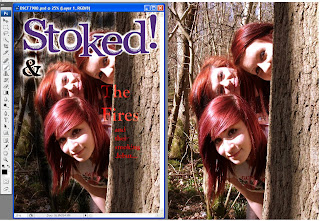
This is my image that I would like for my front cover, and I have decided to edit it in Photoshop. I pasted my magazine title onto the photo and used the eraser to remove the white background, leaving a glowing white outline, so that it stands out from the background and I also did this on the '&' sign. I used the text icon to type text, and used a 'Linear Dodge' effect on the text, and coloured it red to keep it relevant to the band name. I have also darkened the background on the left, so that the text is easier to read, as when I would add text on the left hand side, it was difficult to get the text to stand out. One problem that I am finding is that the 'The Fires' text doesn't stand out as well as I'd like it to, so I will play around in Photoshop to see how I can resolve this. I didn't like the colour of the magazine title against the background, so I will change the title to black. I would also like to make the magazine title be overlapped by the photo.
No comments:
Post a Comment