Here are samples of photos and layouts for my contents page:
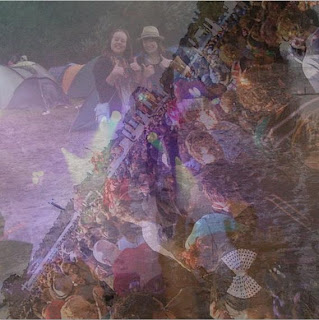
This is the photo that I will use for the 'Stoked! Festival' box in my contents. I created this from my own photos of when I went to Reading Festival last year. I selected photos that showed the crowd, tents, and also a picture of a band playing, as they are some things that people associate with festivals. The photos I used were:
- a long shot of me and a friend in the muddy campsite!
- a high angle shot of the crowd at the main stage.
-a wide shot of the band 'Kids In Glass Houses' playing, that shows the lights, and the crowds hands.
I used 'Multi-Exposure' again on these photos, to be able to get them all in a small space. I like the mixture of them together, as you can see features of each bit, and it also creates a nice fantasy purple colour from the mixture of the stage lights. I would like to have the 'Stoked! festival' logo on top of the photo, as this will show what the photo is relevant to.
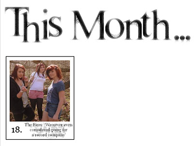
 This is a section of what my contents page is looking like during the construction, and the first content box I have done. I edited the 'This Month' font by adding an 'artistic effect' that makes it look slightly faded, to make it look more interesting. It is similar to the magazine logo, but has a slightly different look to add variety. I placed the photo in a black outlined box and used another artistic effect to edit the number '18' and the small quote. I like the small text, because of the wispy snakelike shape behind it. I then 'sent backwards' the text quote on Microsoft Word so that the outline doesn't show. I chose this mid shot photo because they are positioned close together, and are looking directly at the camera.
  This next photo will be for the 'Indie Style' section on the contents page. I wanted to do this because I think it is an interesting addition to a music magazine, as some readers are likely to be style conscious. I also wanted a small section on fashion to add something more to the magazine. I took mid shots photos of myself with an eagle tshirt, a check shirt and a close up of the satchel bag. I created the collage on Picasa, by selecting the photos and making them into a 'mosiac'. I like this way of presenting the photos because you can see snippets of each photo, whilst having multiple photos in the same area.
Good! Now let's see a mock up of your pages.
ReplyDelete